NextGen Charting Engine
Coming Soon in the Upcoming Core Patch 116
January 12, 2024
Highly Informative Data Visualizations
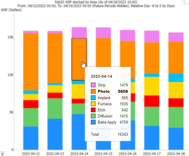
Charts now offer detailed insights at a glance. Tooltips are more informative and Tool State Gantt Charts feature a summary panel, making critical information more visible without extra effort.
Key Information is More Discoverable
Users can now transform charts into boxplots to visualize data distributions and variability. Additionally, users can minimize information overload with clickable legends to isolate data sets.
Highly Responsive and Dynamic
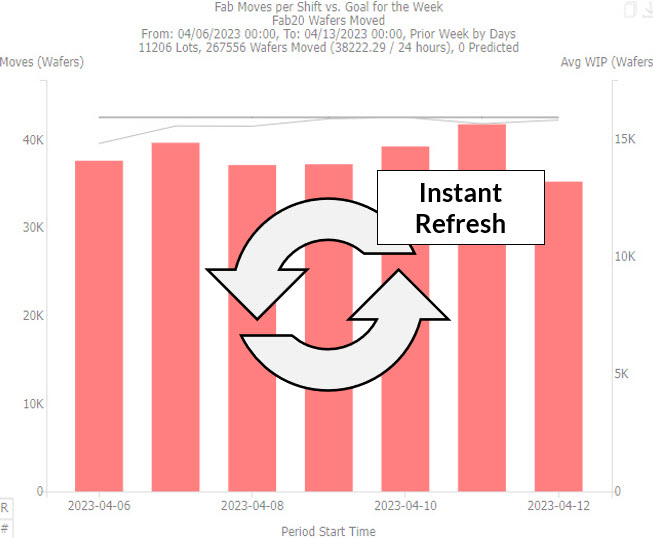
Charts are live and linked to the data grid,
enabling users to configure and see real-time changes without server delays. Charts and title statistics instantly update in response to data grid filtering and sorting.
Enhanced User Experience
The NextGen Charting Engine marks a significant advancement to the FabTime user experience, creating a more intuitive and efficient way for users to interact with their data. While retaining the same familiar charts as before, the NextGen Engine elevates them in aesthetics and functionality, resulting in a more impactful user experience. Users can now gain insights more quickly, as charts have been upgraded to be more informative upfront, displaying information that previously required drill down exploration to uncover. With new configuration options, in just a few clicks, users can present data in various formats to highlight key insights more prominently.
New Functionalities
Elevating Your User Experience to Be More Intuitive and Insightful
Live Charts and Title Stats
All charts and title statistics immediately refresh in response to user modifications from filtering and sorting. These charts are live and directly connected to the data grid, eliminating delays from server wait times.
Improved Tooltips
When hovering over data on a chart, tooltips now provide more detailed information about the period, giving you a clearer and more informative picture of your data.
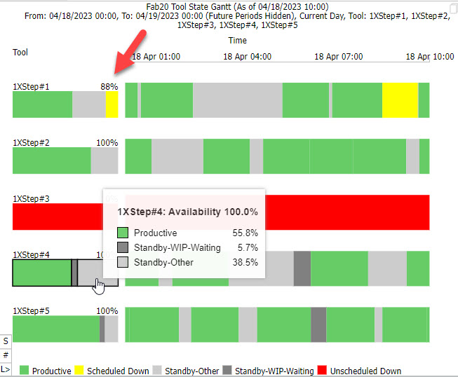
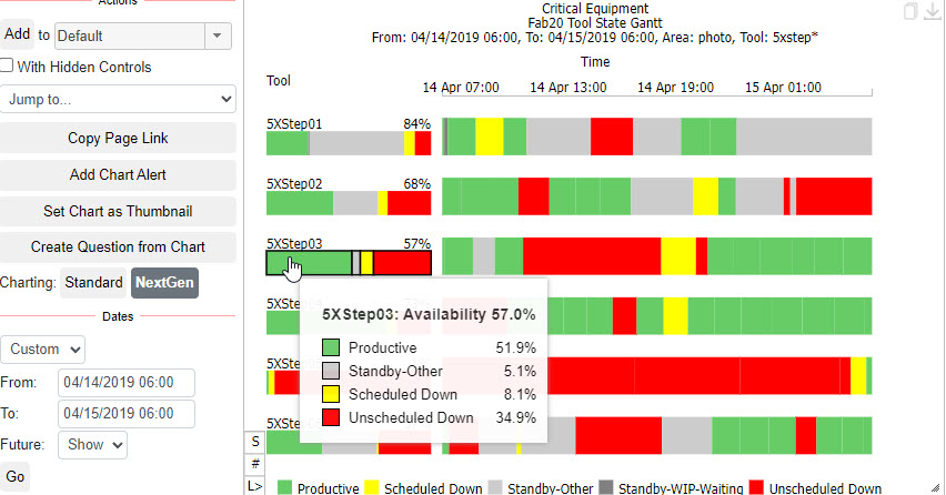
Gantt Summary Pane
The Tool State Gantt Chart now includes a summary pane and displays exact percentages for each state.
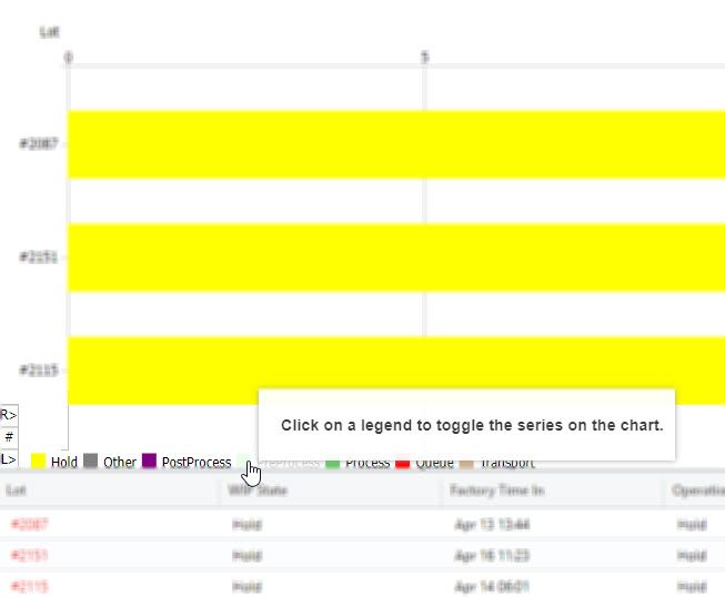
Clickable Legends to Toggle Series
Reduce information overload and focus on relevant data sets with toggle options to hide or display specific series.
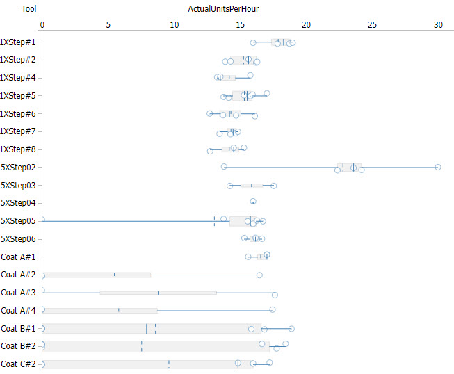
Boxplots
Transform any chart into a boxplot to quickly highlight differences in medians, variability, and the presence of outliers. The boxplot tooltip also includes a histogram.
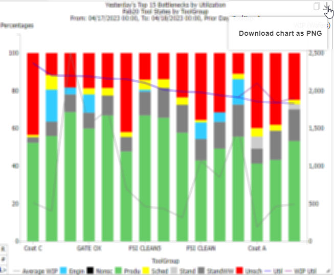
Copy and Download Buttons
Copy charts to your clipboard or download charts as a PNG for easy sharing.
Copyright ©1999-2024 FabTime Inc.